


Inspiration | News | Interior Decorating Tips | Wallpaper | May 11, 2021
Pantone Colour of the Year: Grey & Yellow
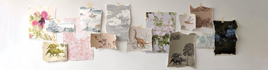
Colour is a big part of what we create here at Sian Zeng. So much thought has gone into not only the intricate detailing of our designs, but the colours used to illuminate them.
Through different colourways, our patterns can embody a number of different tones, that create completely juxtaposing atmospheres in the home. It’s amazing how powerful the use of colour can be and how much of an emotional response it can elicit.
It’s no surprise then that we are fascinated with Pantone’s Colour of the Year. This year, in true 2021 style, Pantone are doing things a little differently, and have named not one but two colours.
They have named Pantone 17-5104 Ultimate Grey and Pantone 13-0647 Illuminating, explaining their choice as “a marriage of colour conveying a message of strength and hopefulness that is both enduring and uplifting.”
We love this and it got us thinking about the way our wallpapers, and the styling of our wallpapers, participates in this marriage of colours.

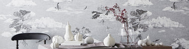
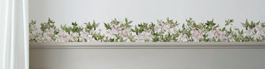
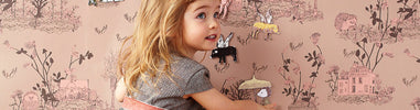
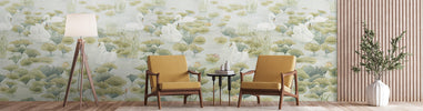
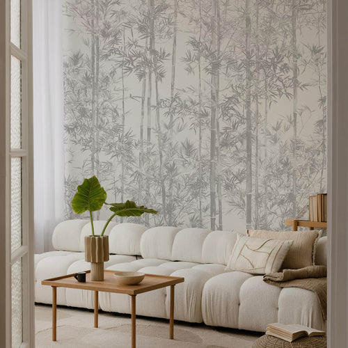
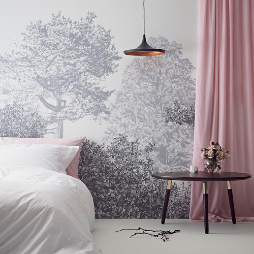
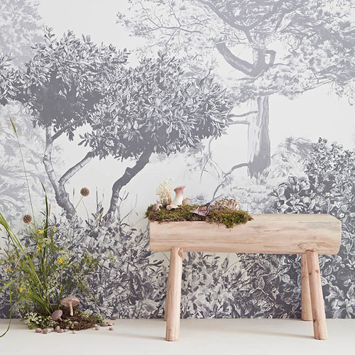
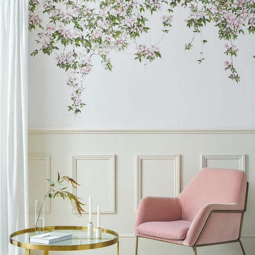
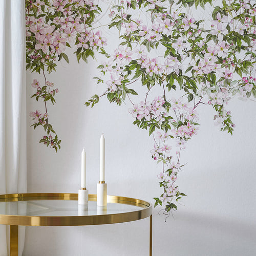
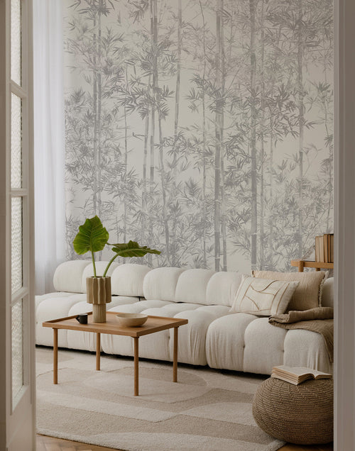
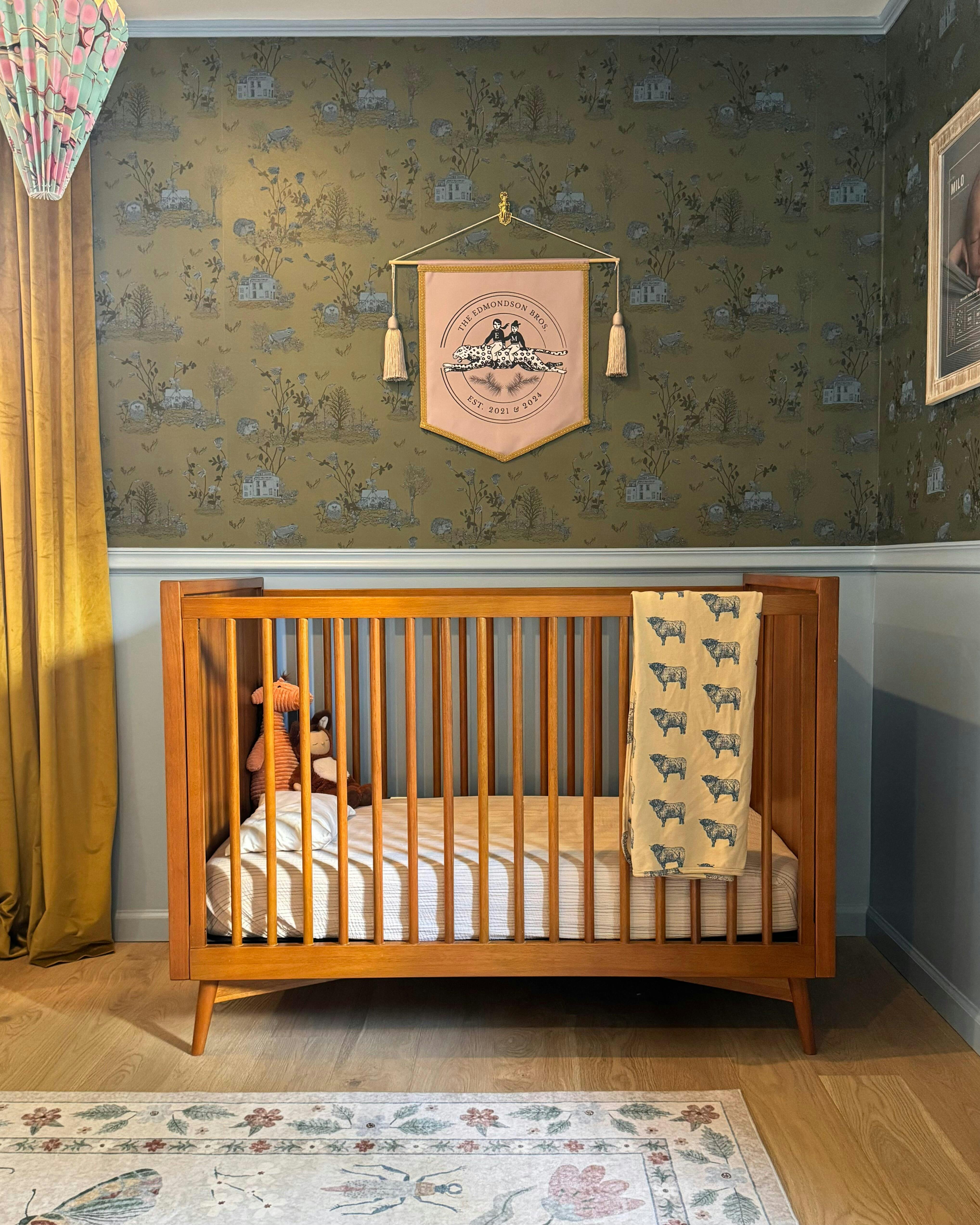
Wallpaper: Hua Trees in Grey
Photo: @sunnycirclestudio
Firstly, a number of our designs are available in grey, a shade we’ve found to be beautifully calming, a joy to style and incredibly versatile.
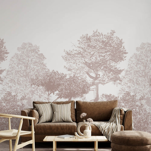
Hua Trees, Dino, Seasons, Mountains and Jungle all incorporate this grounding shade, either accentuating an already calm design or offering a more muted spin on the more playful ones.

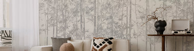
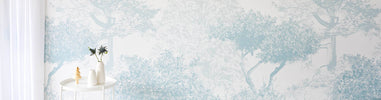
Wallpaper: Jungle in Grey
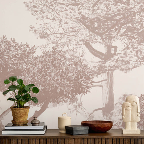
We wholeheartedly agree with Pantone when they say grey is “emblematic of solid and dependable elements which are everlasting and provide a firm foundation.”
This shade really helps to ground a space and is often why it is chosen as the backdrop to a room, creating substance and depth before you dabble with something more lively.
“The colours of pebbles on the beach and natural elements whose weathered appearance highlights an ability to stand the test of time, Ultimate Gray quietly assures, encouraging feelings of composure, steadiness and resilience.”

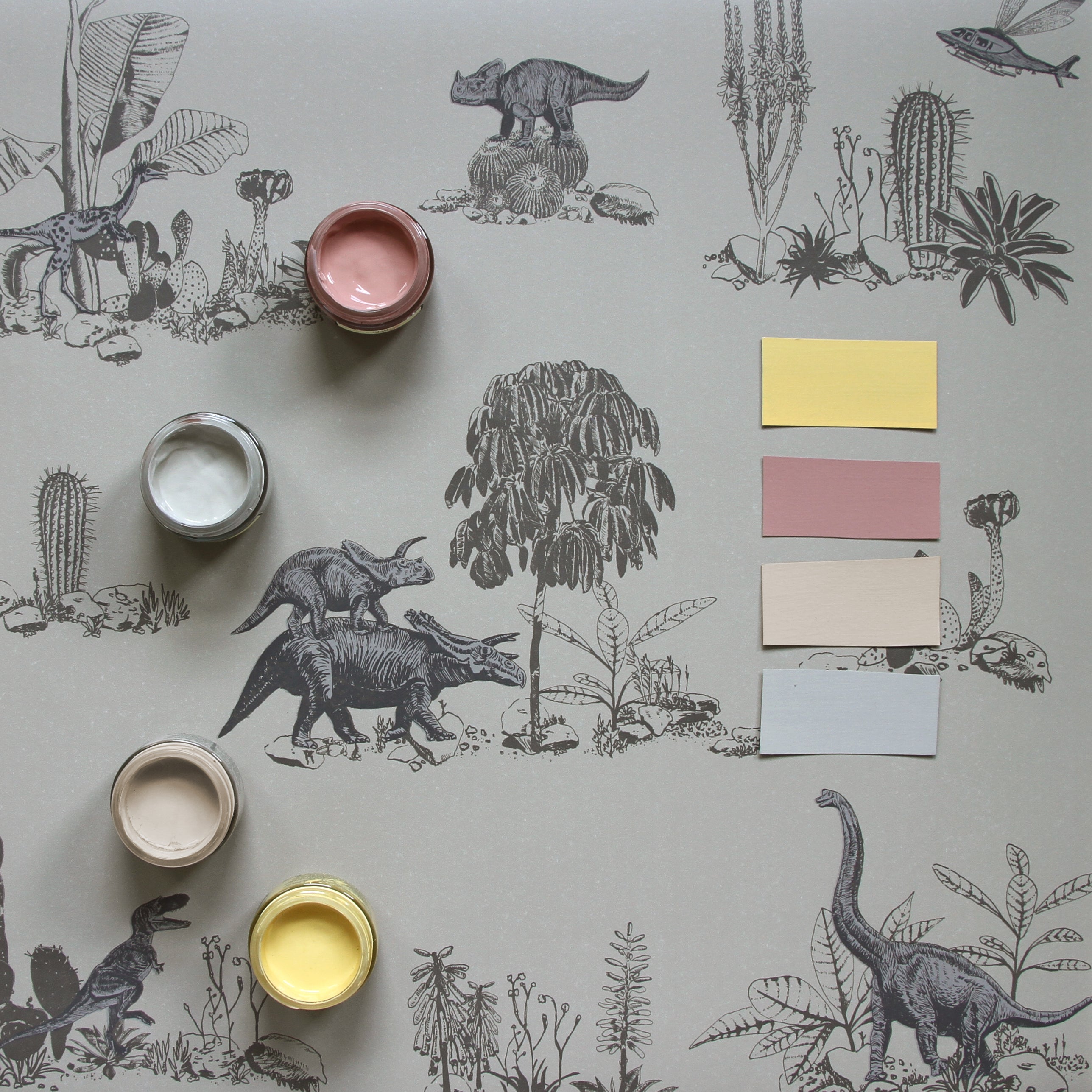
Wallpaper: Dino in Grey
Paint from Little Greene Paint Company: Light Gold 53, Blush 267, Mushroom 142, Serpentine 233
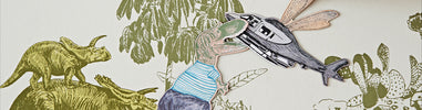
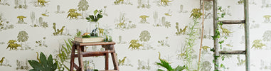
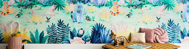
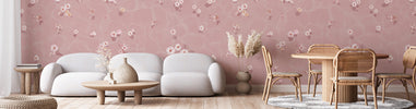
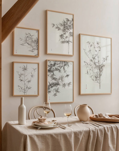
Yellow, which best describes Pantone’s second colour ‘Illuminating’, also features throughout our collections, both in wallpaper and sticker form.
Pops of this sunshine shade can be found in Jungle in Colour, as well as Dino in Yellow Green.

Wallpaper: Jungle in Colour
Photo: @_paintgirl
Undeniably more vibrant than grey, yellow attracts people seeking to both visually and emotionally brighten their space; it’s a colour that sparks feelings of optimism, positivity and joy, channeling the lift you feel on brighter days or the hope ignited by a sunflower.
As Pantone put it, this is “a bright and cheerful yellow sparkling with vivacity, a warming yellow shade imbued with solar power.”

Wallpaper: Dino in Yellow Green
Photo: @annastathakiphoto
Interiors: @fionadukeinteriors
Together, these colours strike a balance that as a designer feels sublime. Not only does the match look like it was meant to be, it creates a real feeling of harmony. The boldness of yellow is offset by grey’s calm, giving it a quiet confidence that radiates, without coming across as too loud.
“Practical and rock solid but at the same time warming and optimistic, the union of PANTONE 17-5104 Ultimate Gray + PANTONE 13-0647 Illuminating is one of strength and positivity.”

Wallpaper: Hua Trees in Grey
Photo: @hannahargyle
It is the idea of balance that we found the most interesting from Pantone this year. It’s been an undeniably difficult time for many, with all of us faced with the uncertainty of the pandemic and the challenges that have surfaced as a result.
What lies before us is still just as uncertain, but it does feel like a balanced approach will get us through; energies of calm and hope, an approach that both grounds us and lifts us up.

Wallpaper: Seasons Winter Snowdrift
As Pantone highlights, “this is a colour combination that gives us resilience and hope.”
We hope this piece has given you some inspiration for your interior spaces this year, but also how you might use this optimistic pairing in your life as a whole.
Thank you to all our customers and collaborators for creating such beautiful content over the years and providing us with some gorgeous images to share with this post.
If you’re feeling inspired in the home decor sense, do check out our range of dreamy, storytelling wallpapers for your home.
Read more from the Blog:
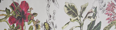
Styling our Dino Wallpaper in Pink Green: Q+A with Tara Moon


£245.00
£245.00
£245.00


Leave your comment!