


Inspiration | News | Interior Decorating Tips | Wallpaper | October 09, 2018
Embracing Colors and Wallpaper with Interior Designer Heather Milner
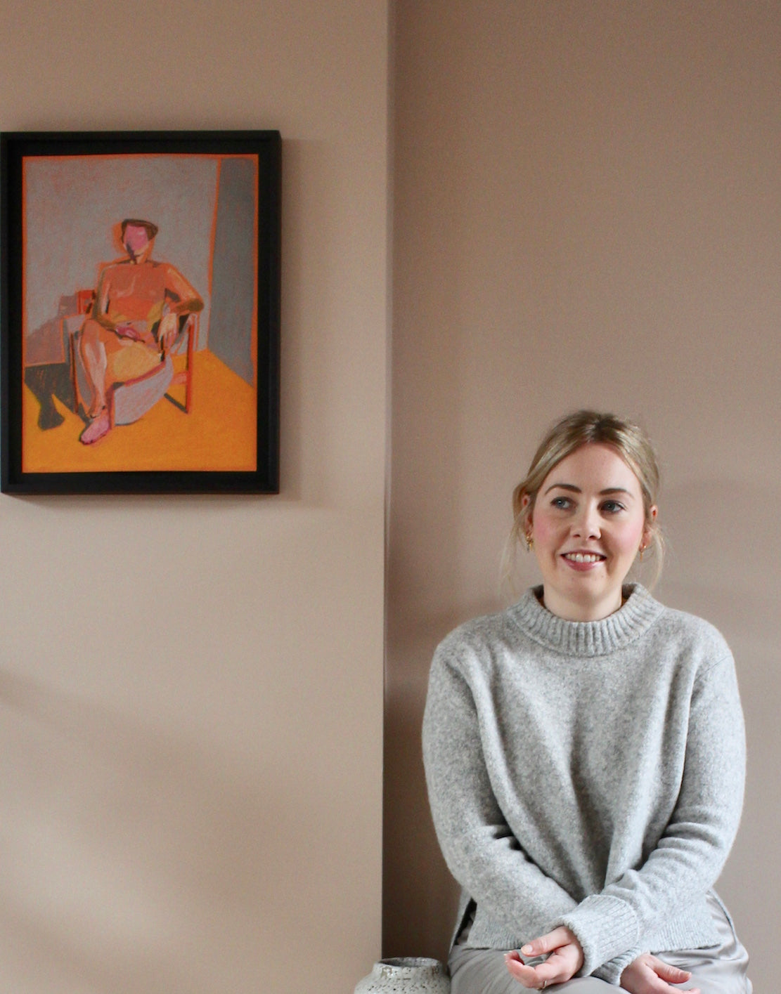
“I see pink as a neutral, the same way as grey.” It's no wonder that Heather Milner — interior designer and owner of Inside Her Home — infuses her client and personal projects with bold, beautiful uses of color. Marrying Scandinavian influences with warm hues, Heather's thematic approach to designing and home styling is both fun and practical.
We sat down with Heather to ask her all things interior design, from the mistakes people make with color to which room works best with wallpaper. And, of course, which Sian Zeng wallpaper is her absolute favourite...
1. Tell us about your interior styling business, Inside Her Home. How did you get started?
It all happened really organically. I have been lucky that platforms such as Instagram and Pinterest have helped ignite and vocalise a renewed love of interior design amongst online communities – it feels like a real movement right now!
With a background in the crazy worlds of PR and advertising, I was often on photo shoots or film shoots acting as the stylist (clients never wanted to pay for one!), which gave me lots of hands-on experience by accident. I always loved it, and once I was lucky enough to buy my own home, I started exploring the design aspect of interiors and fell madly in love with the process.
I did some formal training, and through my blog, I started to be approached by people who wanted a beautiful home but felt overwhelmed by their own Pinterest boards! That’s when I launched Inside Her Home – a styling and design service where I help people curate the inspiration they are bombarded with on social media and in magazines to create a truly beautiful and personal home.
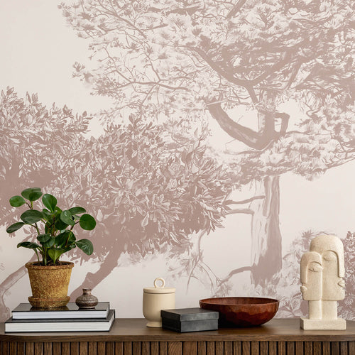
“What I love about wallpaper is that it is an affordable and stunning way to create drama and add depth.”
2. Your Instagram says you love peachy-coloured rooms! What draws you to the colour?
For a long time, I was resistant to colour, or at least I always used it sparingly. This had a lot to do with the Scandinavian design aesthetic, which is very restrained and monochromatic. While I still find it inspiring, [I can now see that it] influenced me a little too much initially. I now feel that I have a much better understanding of my style and what colours I am attracted to, and those which I am not.
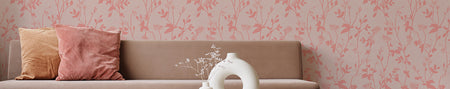
Pink has been (and still is) a serious interiors trend, but I honestly have started to see it as a neutral, in the same way that grey was for a long time. My love affair with the colour started when I had my loft plastered – that natural peachy pink colour of the plaster, coupled with the softness of the finish, was just gorgeously warm and fresh all at the same time. Pink is also really versatile and pairs beautifully with some of my favourite accent colours – deep blues, rich greens and burgundy.
3. Now let’s talk about the design process. Where do you begin when planning a room? Do you try to stick to a definite plan, or does it come together piece by piece?
Every project is different, but it has to start with the homeowner. Quite often people do have one piece of furniture that acts as the starting point. Occasionally it’s a total blank canvas, in which case you need to start with how the room is used and work outwards from there. Most people who come to me have hundreds of pinterest boards and ideas, so I go through those to identify themes in order to get to the heart of why certain images and colours spoke to them. That’s a really fun part, and it ensures the whole process is really collaborative.
4. Is there a general rule to what comes first when you design, i.e. furniture, colours, etc.? What is the first thing you look at when walking into a room?
It’s probably because of my background in PR, but I like to start by creating an overriding theme (or headline!) for each project. Having a title and putting words to it really help focus my process. I start to ideate around this by looking for inspiration in all kinds of areas: art, architecture, fashion magazines, food packaging and advertising – anywhere really! It’s amazing how many places you can find new and interesting ideas that you can take into a design.
5. What is the most important factor for you when putting together a design?
It’s really important to me that the space is somewhere people can really live and be comfortable. Obviously, it needs to be beautiful, but we don’t live in Instagram squares – I want my designs to be personal and part of a journey which will evolve as the family who lives inside it does.
6. Colour obviously plays an important part of your style. How do you approach working with colour? What is a good piece of advice for our readers about choosing colours for their home?
Colour is so personal and most people will have a natural affinity with certain shades. A good place to start is by looking inside your wardrobe, because you’ll probably start to see some recurring themes.
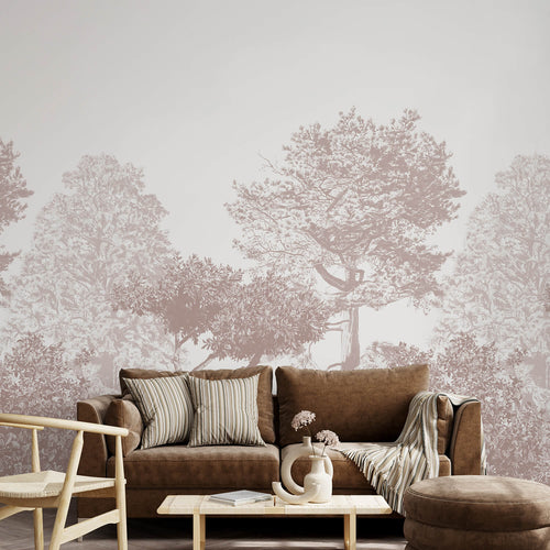
The biggest mistake people make when using colour in their homes is matching a bold paint colour with neutral accessories because it feels ‘safe’. It is much more effective to match it with more colour in a complementary and/or contrasting shade through your accessories. For example, a dark greeny-blue on the walls will be transformed when complimented with soft pink accessories and gold accents. Don’t just go grey!
7. Designing rooms for other people is obviously a very personal thing for them — it must be quite nerve-racking! How do you liaise with your clients about what they want?
The most important thing is to be open, honest and prepared. Most clients I work with have approached me because they already like my style, meaning we are aligned from the start, which helps! From there, I spend a lot of time understanding their practical needs, as well as their own stylistic ambitions for the space, working to ‘curate’ their own inspirations into the perfect scheme.
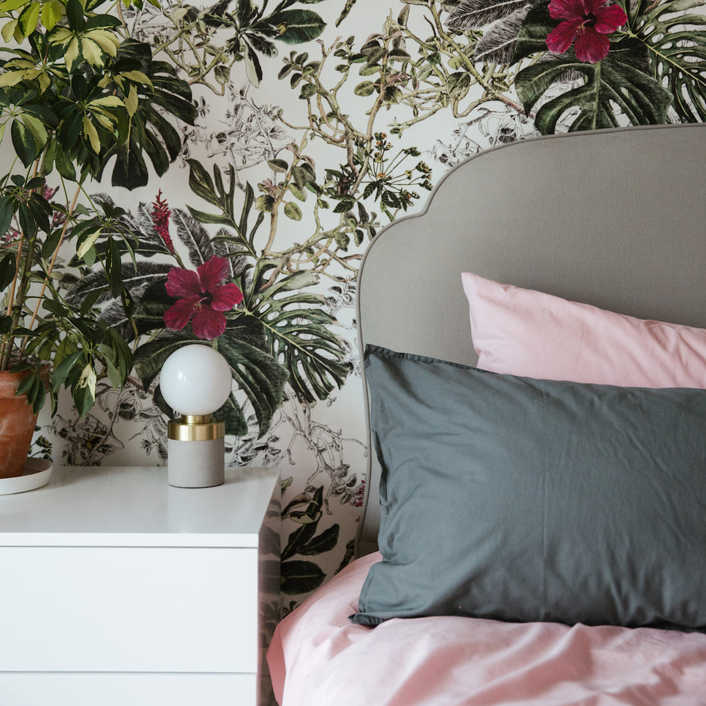
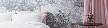
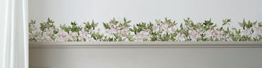
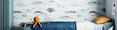
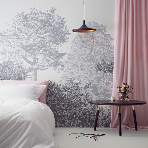
Bedroom featuring Sian Zeng Tropical Bloom Wallpaper; photo by Joanne Crawford
8. Let’s talk about wallpaper. Do you have any tips for decorating with wallpaper?
One of the most important things in any room is the focal point! In period homes, this is often a great fireplace or huge windows. However, the reality is that in many new properties – or in less formal rooms in the home – you have to work a little bit harder [to find the focal point].
Statement furniture and beautiful artwork are great ways to add a focal point, but both are expensive and not always practical. What I love about wallpaper is that it is an affordable and stunning way to create drama and add depth.
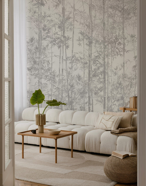
9. Which rooms do you think work best with wallpaper?
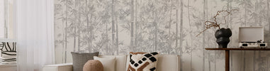
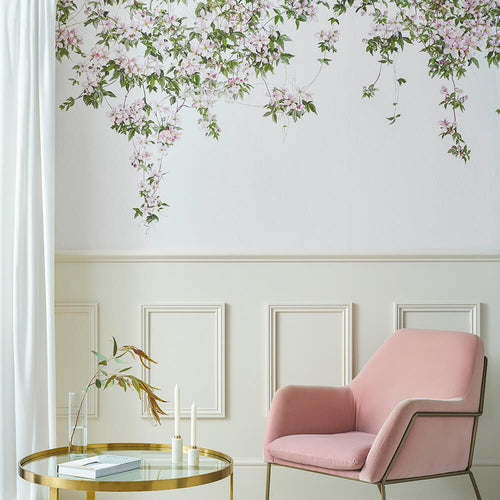
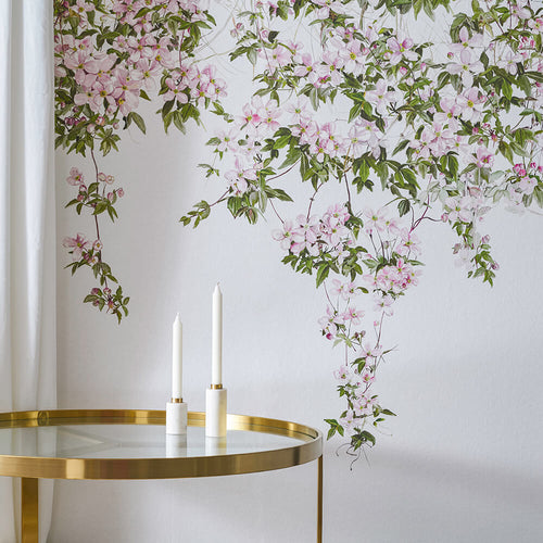
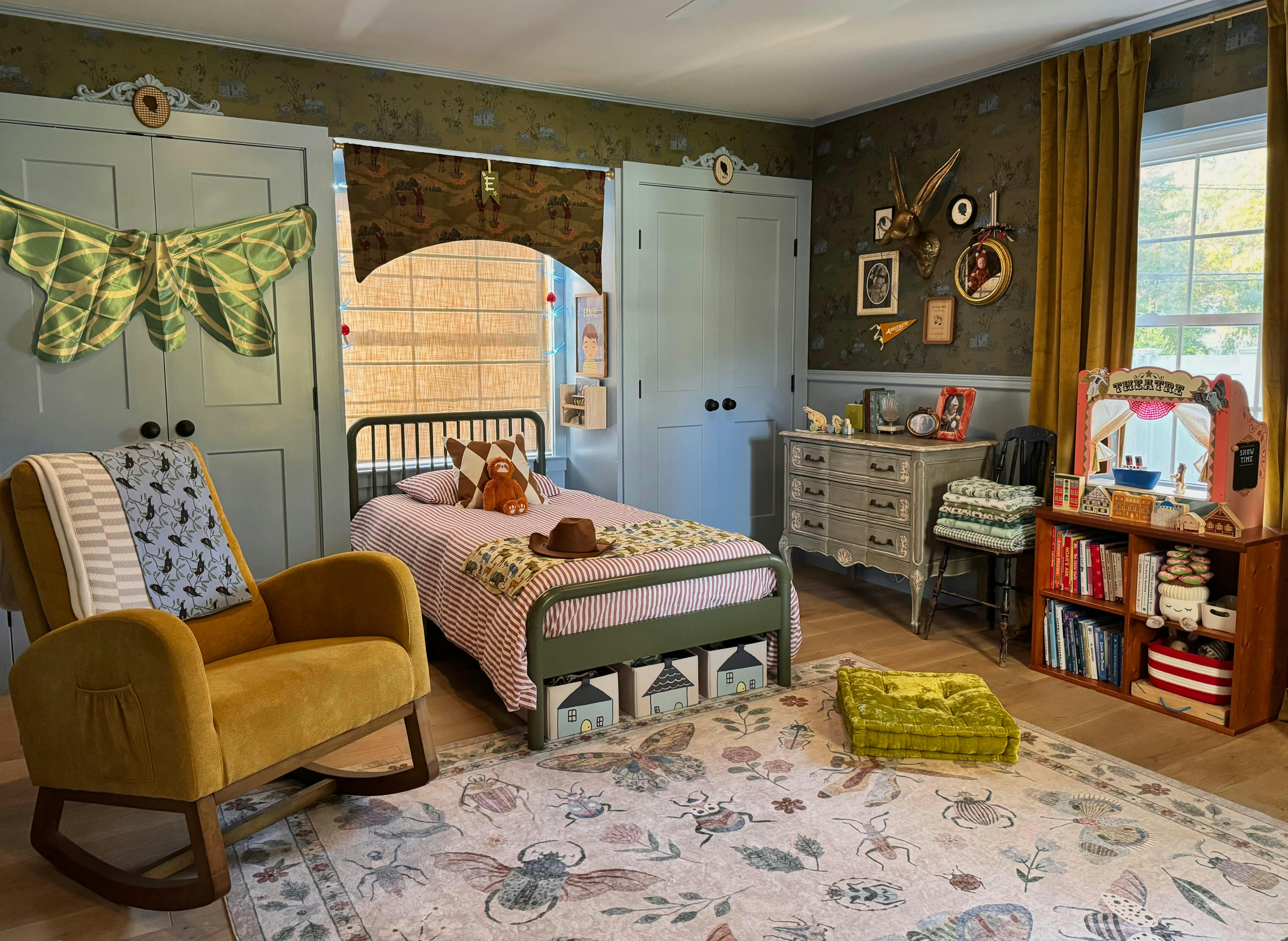
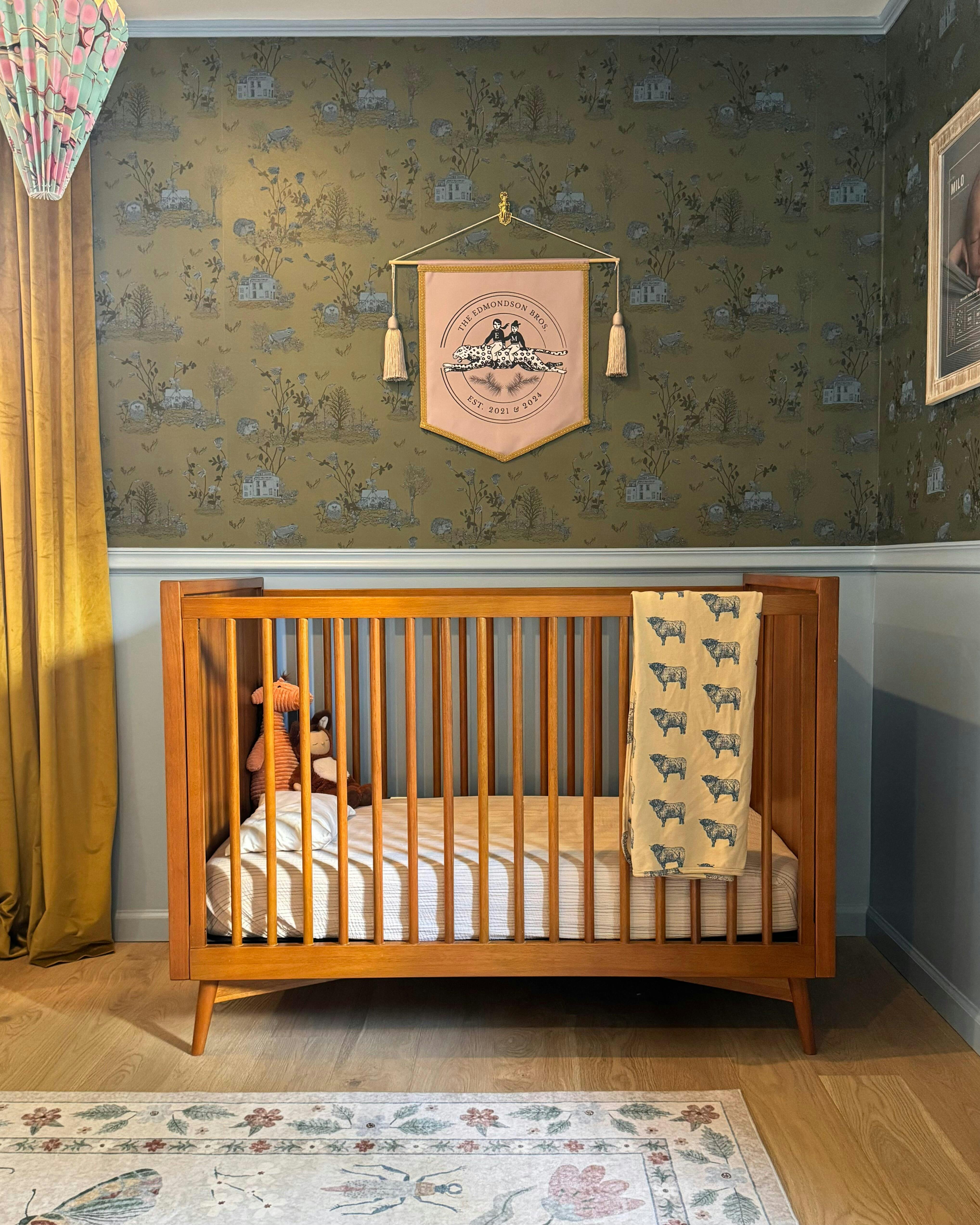
I particularly like wallpaper in bedrooms – I think you have more freedom to be creative and dramatic in a bedroom over kitchens or living rooms, which have more functional demands and are used all day. At the moment, I love contrasting the romance of florals with monochromatic Scandinavian furniture and accessories – feels really fresh and current, but with a nod to the traditional.
10. And last but not least: what’s your favourite Sian Zeng wallpaper? How would you style it?
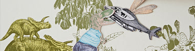
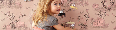
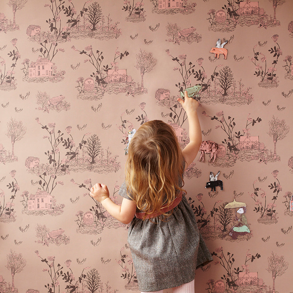
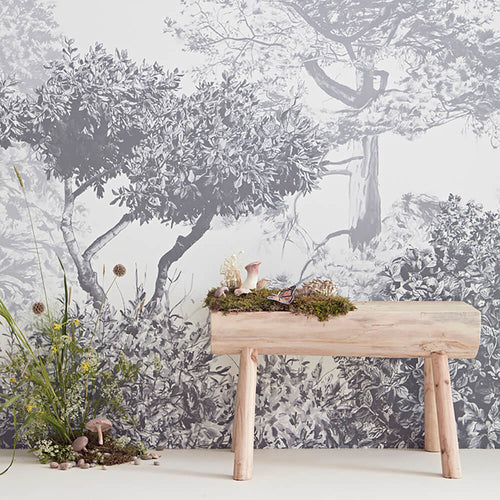
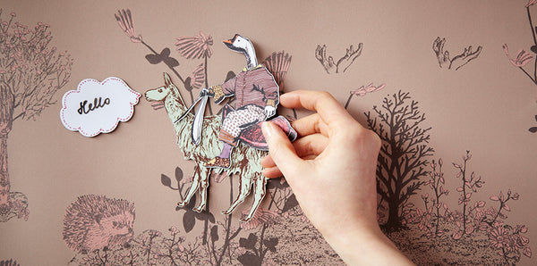
The Woodlands wallpaper in Brown Pink is one of my favourite designs. Perfect for a children’s bedroom, it is romantic and magical, but the colourway still feels mature and interesting. The magnetic additions to the design add such a gorgeous interactive element which breathes life into the entire room. I would style this simply, with natural wood furniture and soft, crumpled linens.


£245.00
£245.00
£245.00


Leave your comment!