


Inspiration | News | Interior Decorating Tips | Wallpaper | June 26, 2018
The Best Paint Colours for your Wallpaper
While we live for wallpapers here at Sian Zeng, we also understand that wallpaper is just one small part of your home design. There is a myriad of considerations that go into creating a cohesive home – one of which is choosing the right paint colours to match your wallpaper.
When it comes to choosing paints for our wallpaper photo shoots, we adore using Farrow & Ball, purveyors of on-trend, quality paints with whimsical paint names that each tell a story. Many of you have asked us which colours we selected for each wallpaper design. This blog post is here to answer.
But firstly, how do you find the right colours for your space? Farrow & Ball provide a few helpful tips:
- Get Inspired – use home magazines and Pinterest to find inspiration in what other people have done. Collate your favourite images into a mood board so you can understand the final look and feel
- Buy testers – Sample paint pots are a great way to test the colour in your space before committing to anything drastic. Farrow & Ball recommend painting an A4 sheet of paper so you can see how the colour looks around the room
- Consider lighting – What will your paint colours look like in natural light? At night? In artificial lighting? Lighting is so important when it comes to choosing paint colours. Spend some time analysing your colour choices in various stages of lighting. What looks great on Pinterest may not work in the lighting of your home.
With these practices in mind, which colours did we choose to go with our Sian Zeng wallpaper prints? Read on to find out!
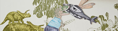
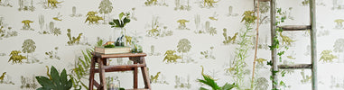
Dino Wallpaper in Yellow Green

For Dino in Yellow Green, we think Card Room Green No79 works beautifully! The colour is named after the types of study rooms that were much favoured in the Victorian period.

In a previous Dino photoshoot, we painted the skirting board Calke Green. Farrow & Ball describe this shade as a ‘cleaned version’ of a colour originally found in the breakfast room of Calke House, a Grade 1 listed country house in Derbyshire.
Dino Wallpaper in Pink Green

With our Dino print in Pink Green, we chose the soft blue-grey colour of Pigeon 25. Named after the pigeons you find wild in London’s landscape, we love the moodiness of this sombre colour. Plus, when a paint is named after our home, we love to use it.
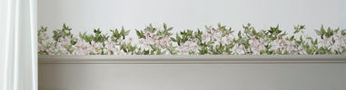
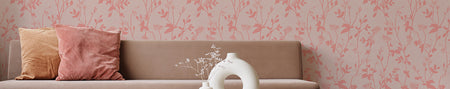
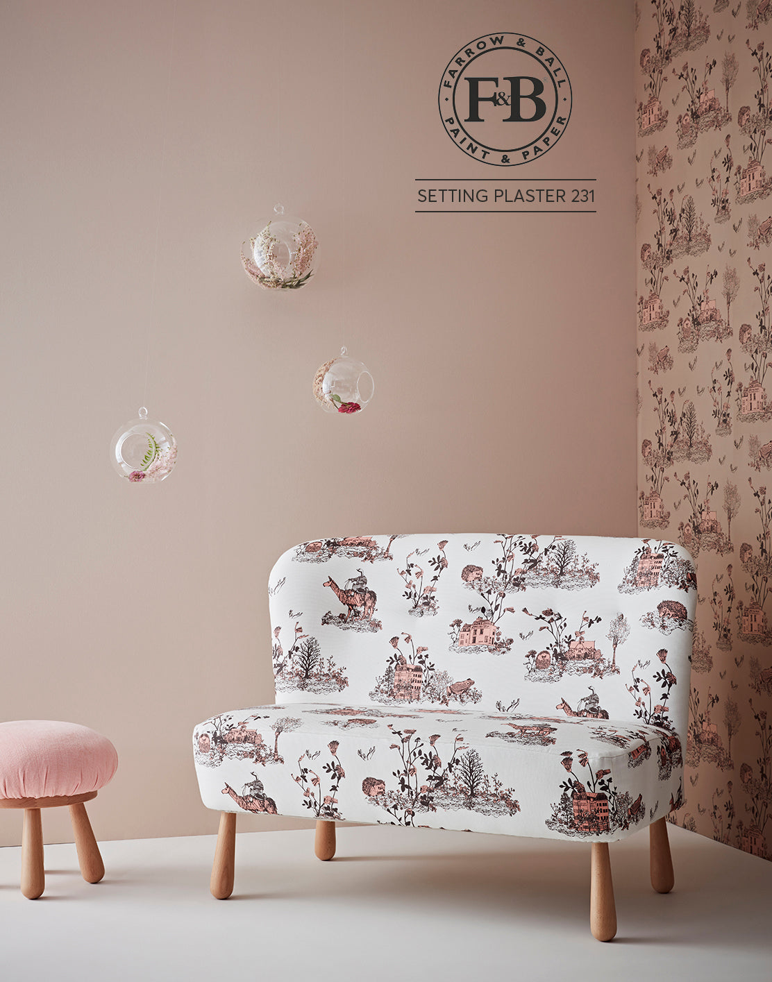
Woodlands Wallpaper in Brown Pink

A dusty pink, named after the blushing walls we often admire in newly plastered houses, we loved using Setting Plaster No231 with our Woodlands Wallpaper in Brown Pink. Perfect!
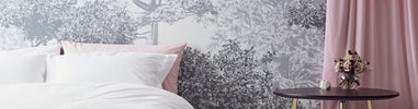
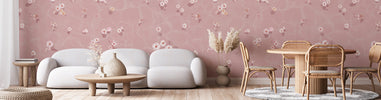
Mountains Wallpaper in Grey Pink

We painted the wooden black plinth styled with our Mountains Grey Pink wallpaper in Off Black 57. This soft black is one of the original Farrow & Ball colours. We love how the black brings out the darker aspects of the mountains.

Looking for a pink to match your Mountains wallpaper in Grey Pink? Although we didn't end up using this colour in the photoshoot, we tested Calamine 230 and learned it goes perfectly. And yes – it really is named after calamine lotion!

If you prefer a lighter pink, we also recommend Middleton Pink 245, which is named after the beautiful Duchess of Cambridge. It isn’t only blue that’s royal these days!
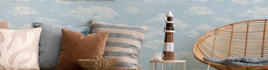
Mountains Wallpaper in Blue Peach


If you’re looking to match the colours in our Mountains Blue Peach print more precisely, we love the rich hues of Light Blue 22 and Oval Room Blue 85 . Or, if you’re looking for a brighter, punchier colour to compliment this soothing print, Pink Ground 202 Is the perfect shade.
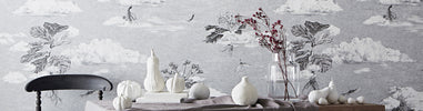
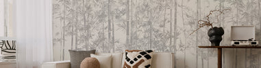
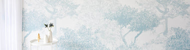
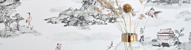
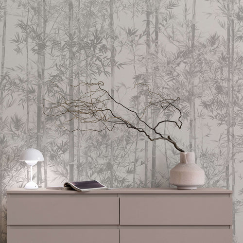
Hua Trees Wallpaper


For both of our Hua Trees wallpaper colourways, a shade of white paint goes best, which helps to extend the white space above the design and create a whimsical landscape. The most accurate colour is a shade between the of All White 2005 (a pure white) and Wevet 273 (which contains a hint of grey).
Why Wevet? An old Dorset term for a spider's web, this paint colour's translucent and delicate quality inspired its historic and apt name.
Which colours have you chosen to go with your Sian Zeng wallpaper? What are your tips for choosing the best colours for your wallpaper?


£245.00
£245.00
£245.00


Leave your comment!